
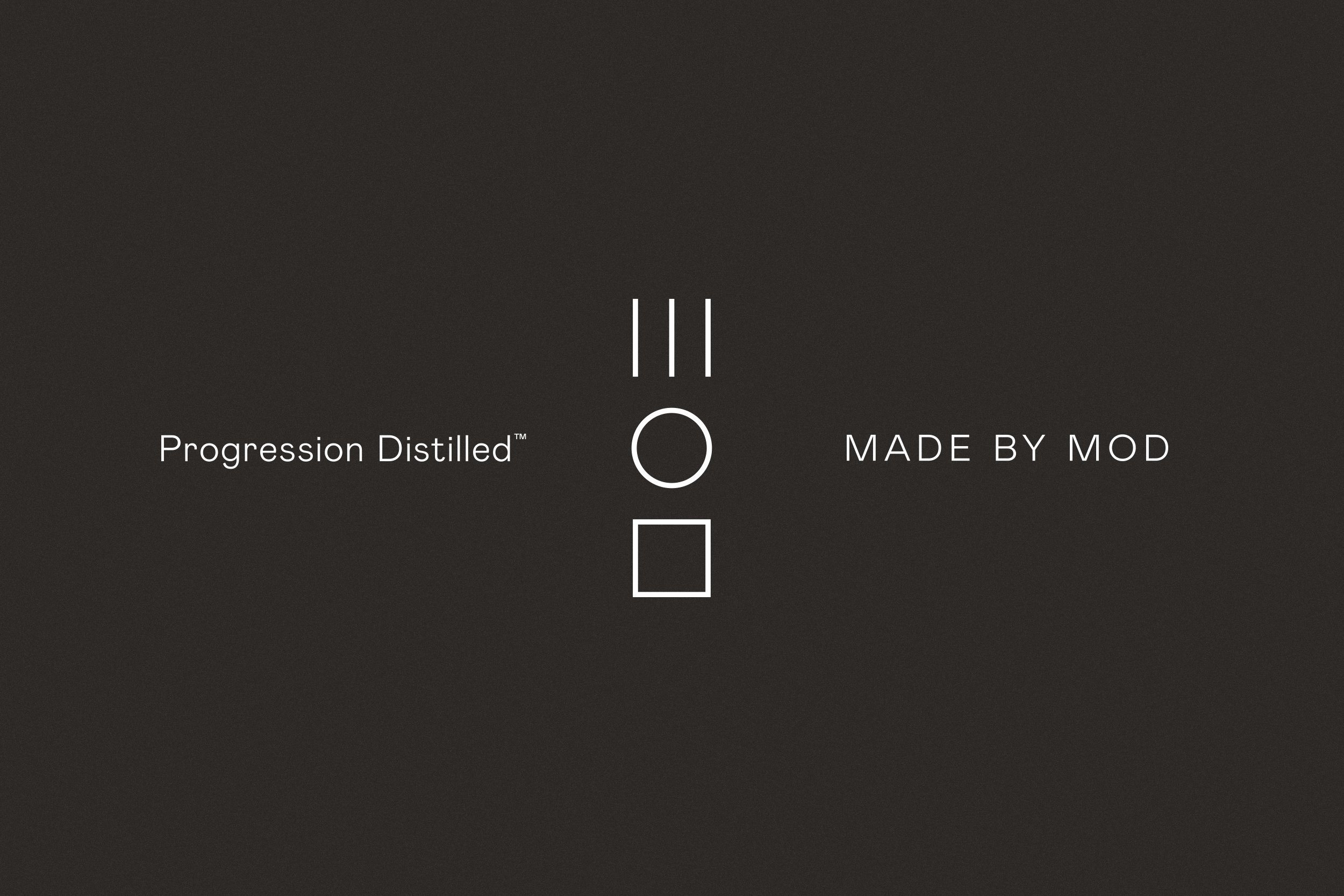
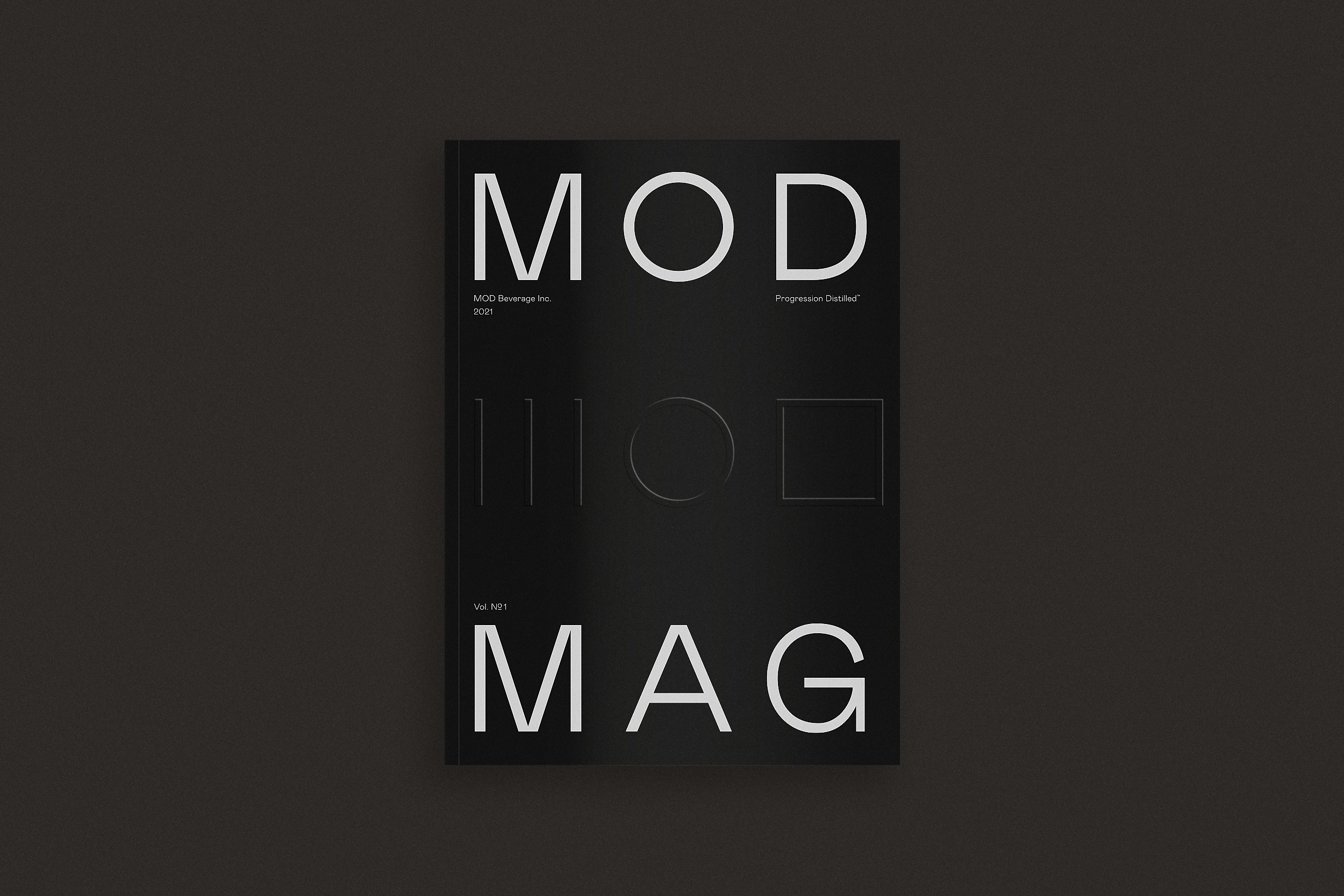
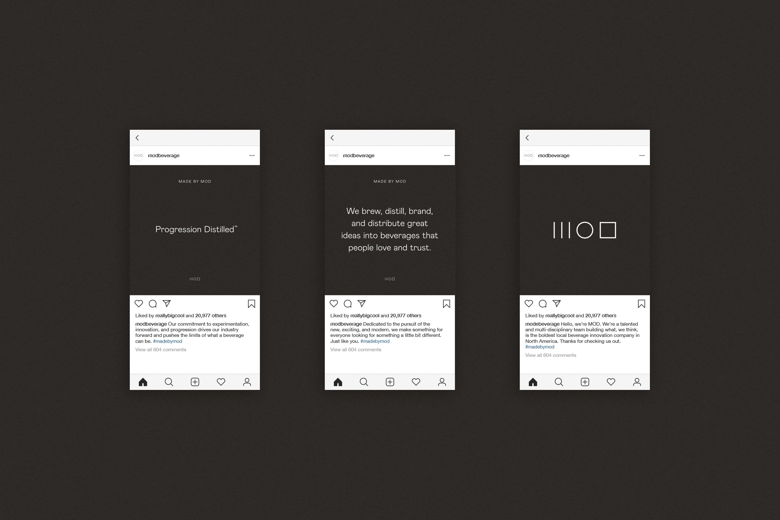
Progression Distilled.
I was approached by MOD, a beverage development brand rooted in a very established industry, to help them reinvent and modernize their vibe to feel more experimental, innovative, and progressive — three traits they live by to help define their unique brand character.
The result was a new brand identity that positioned MOD at the intersection of beverage innovation and stylish brand development.
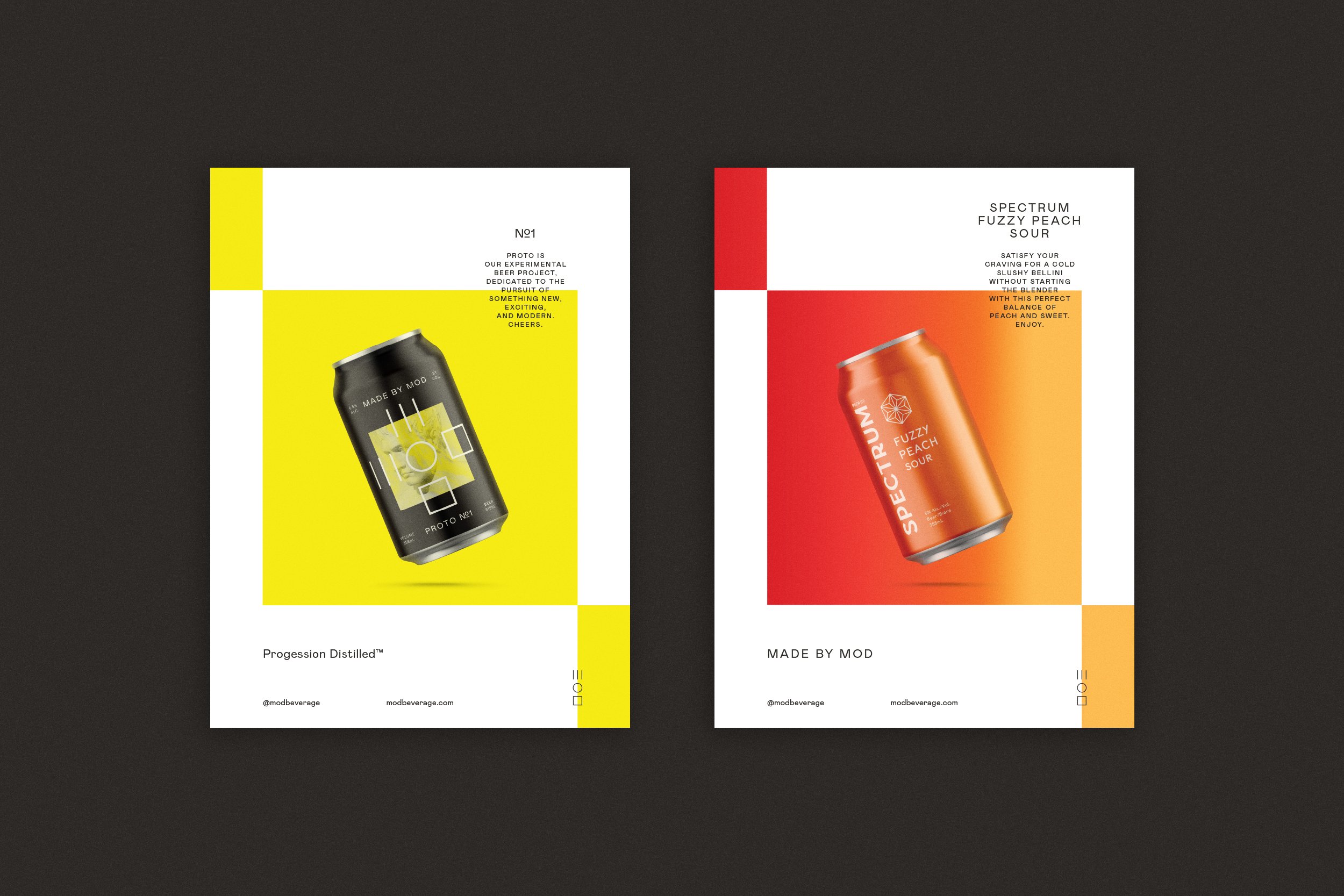
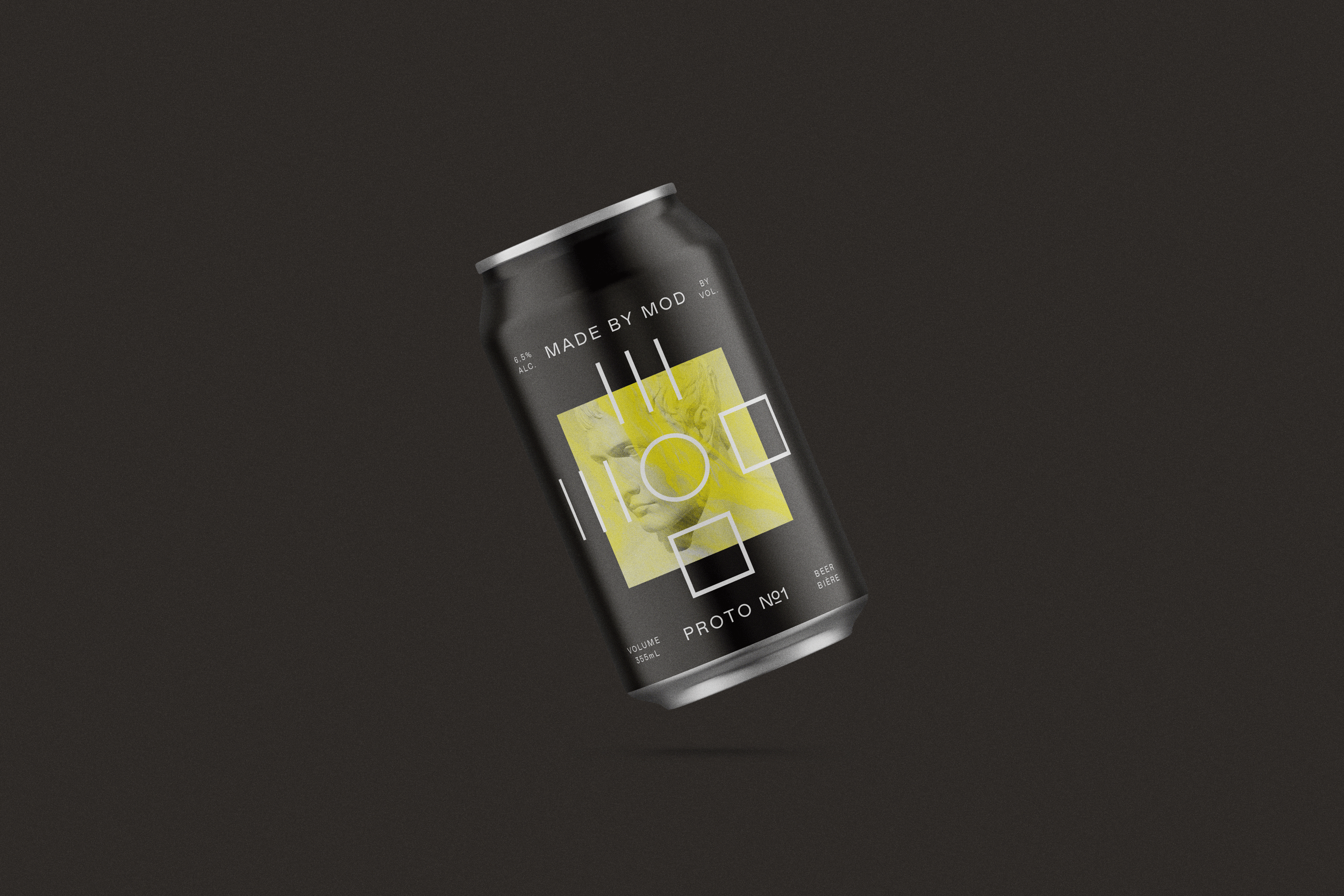
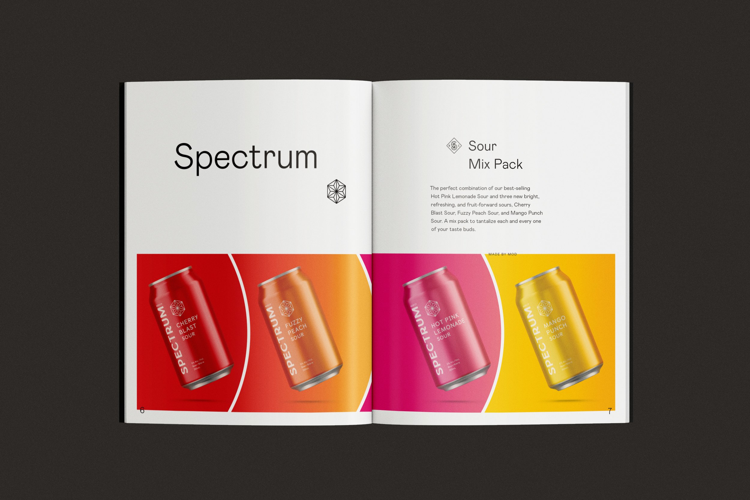
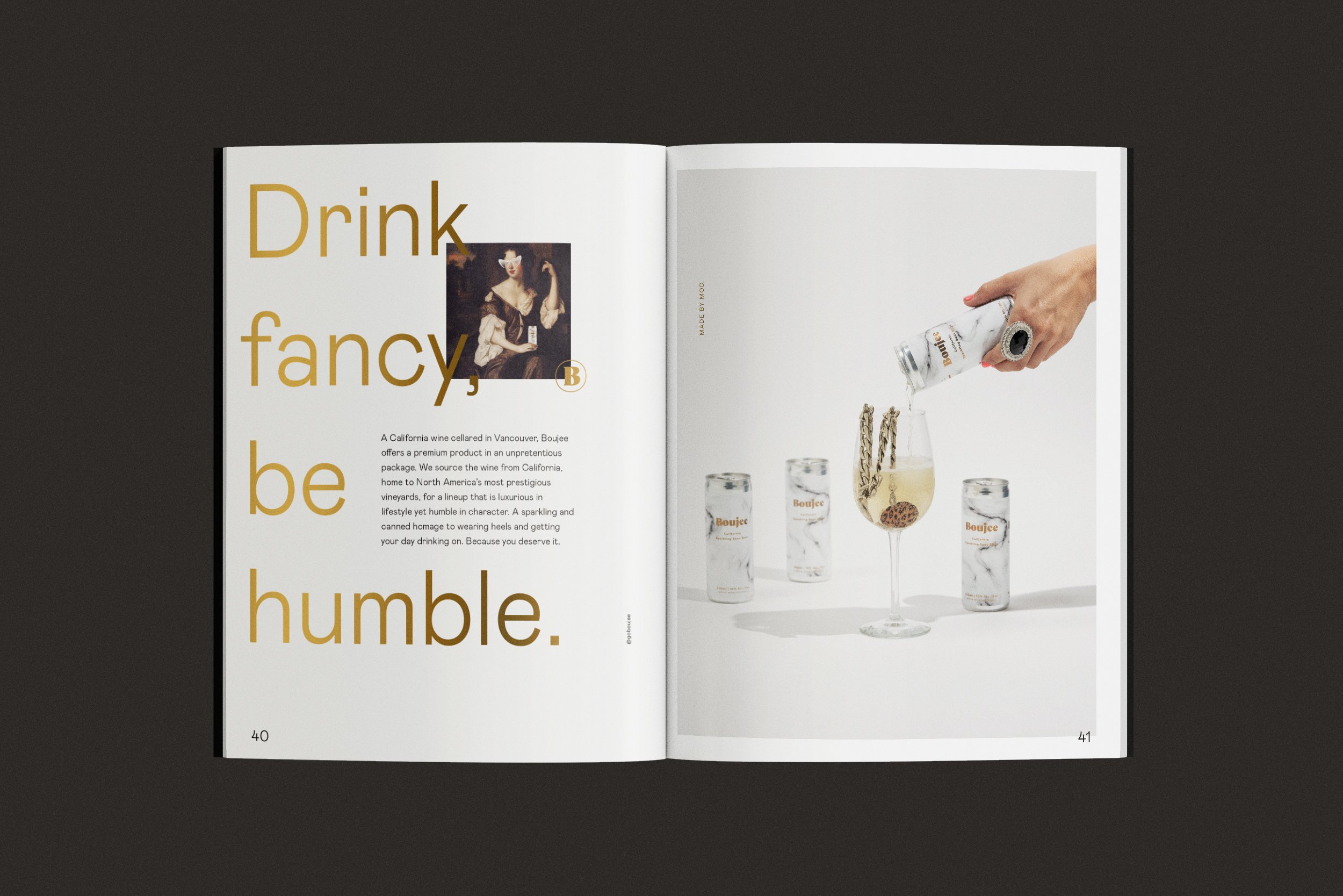
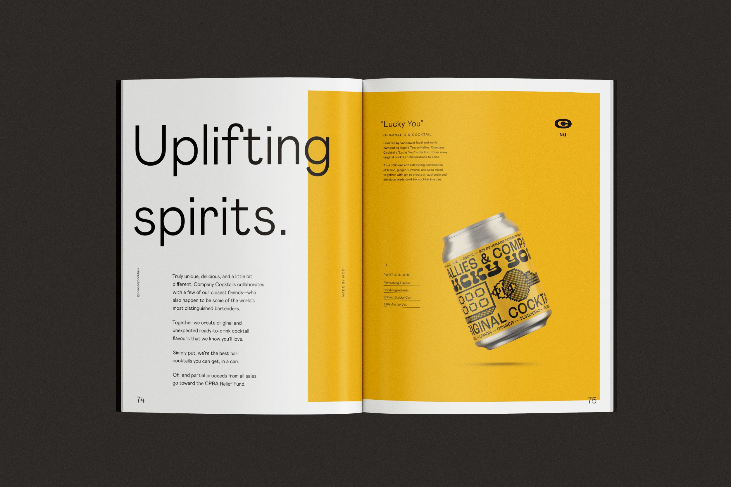
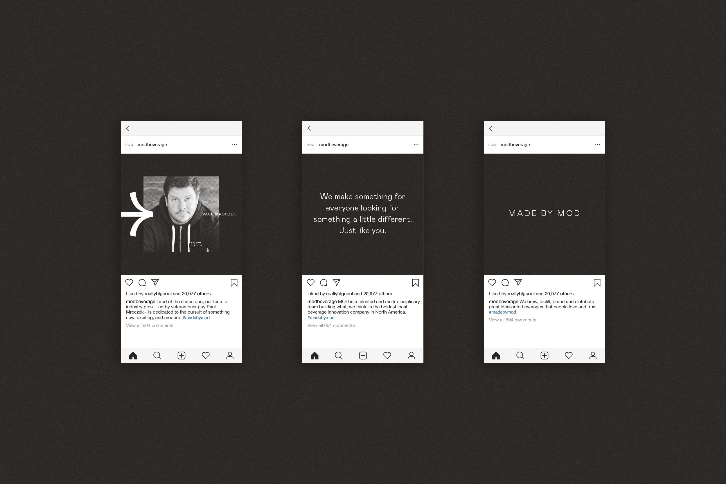
MOD boasts an extensive portfolio of unique beverage brands but wanted their new branding to stand alone, leave their past behind without forgetting where they’d come from.
This made it crucial that the new identity be built on a flexible system that could seamlessly support content from any one of their current established or future brands, while being strong enough to stand on its own.
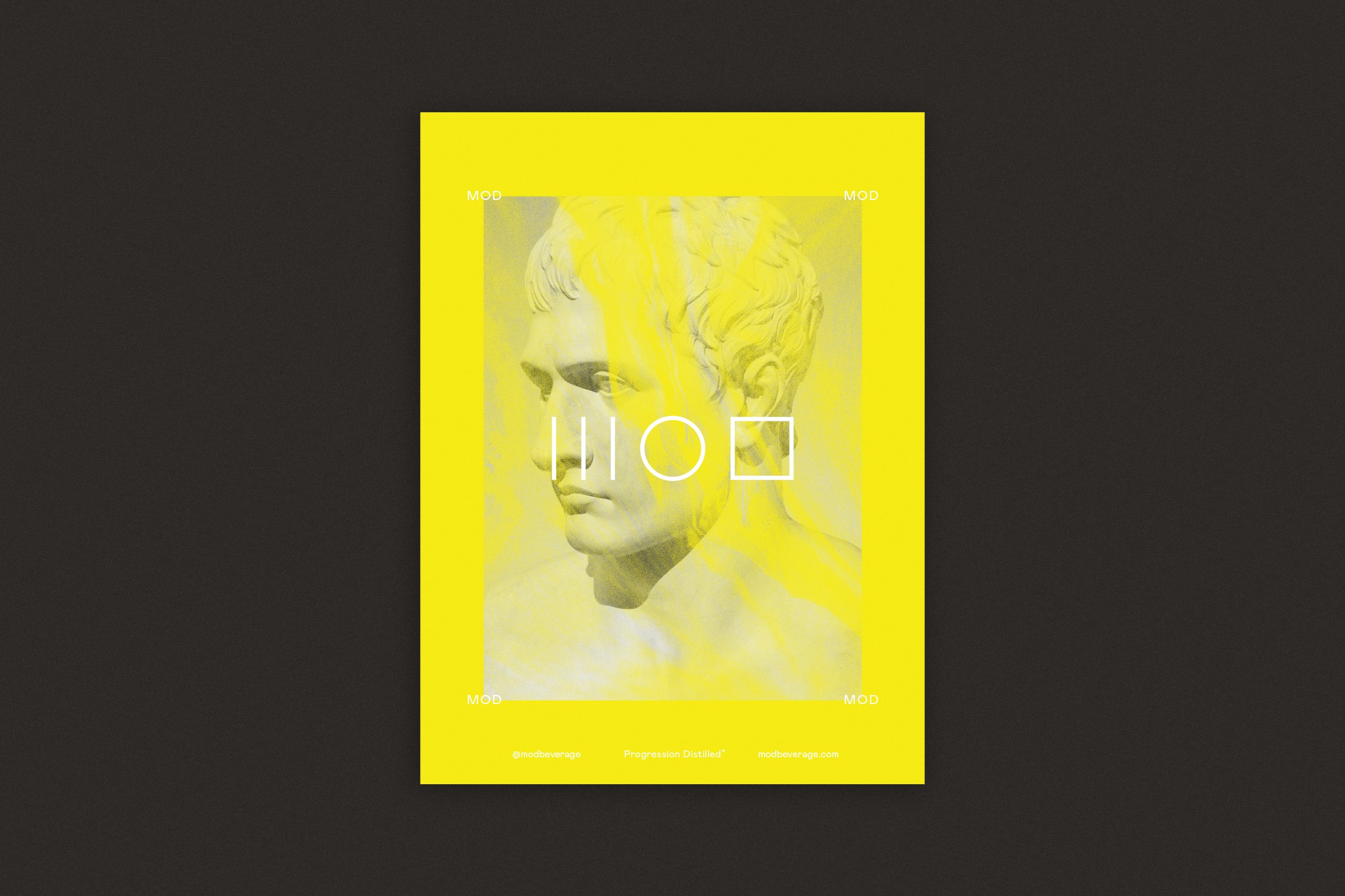
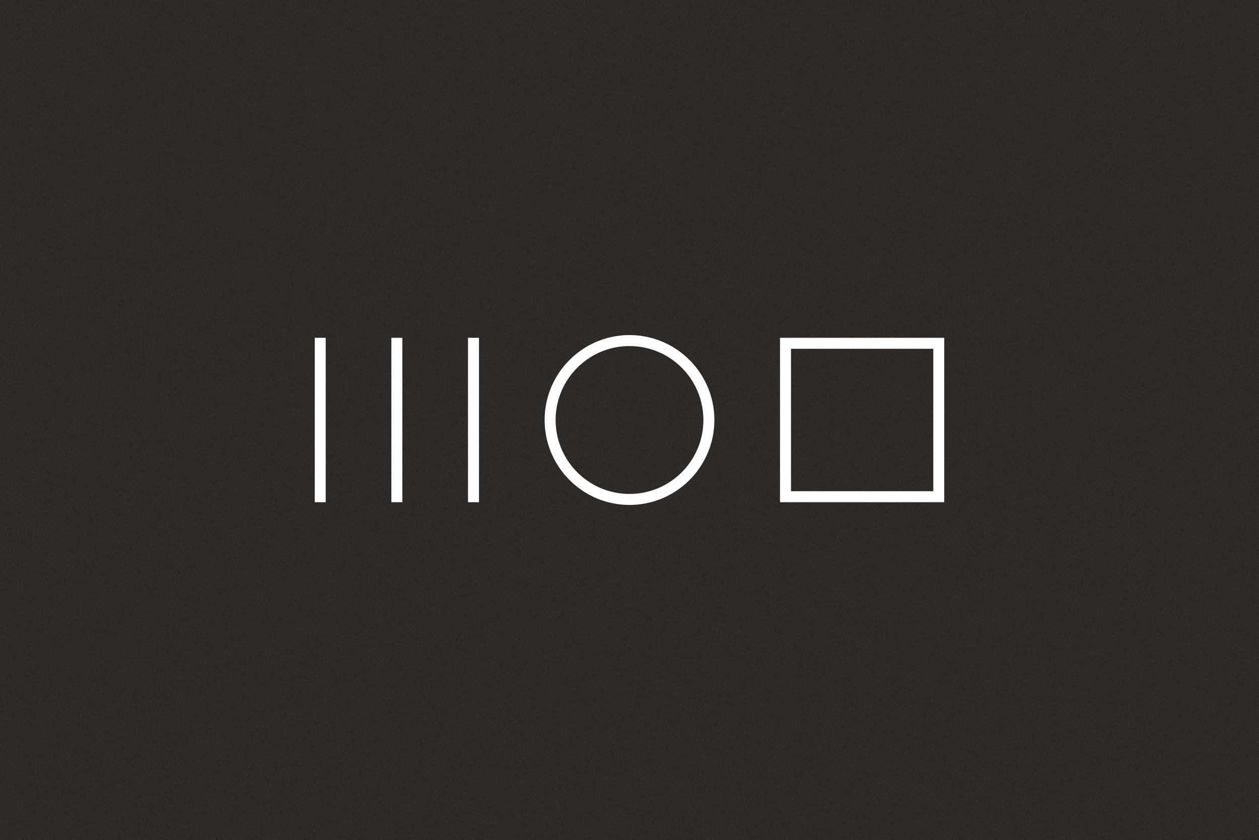
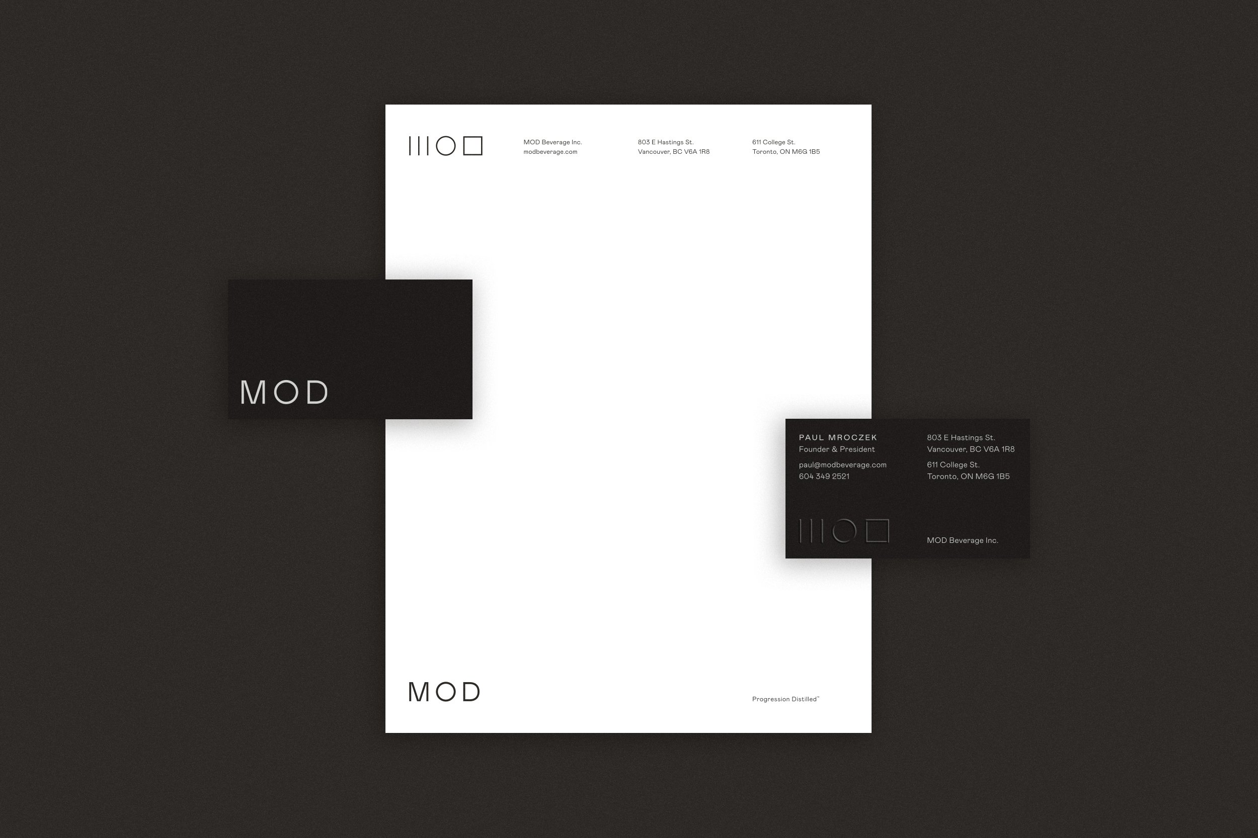
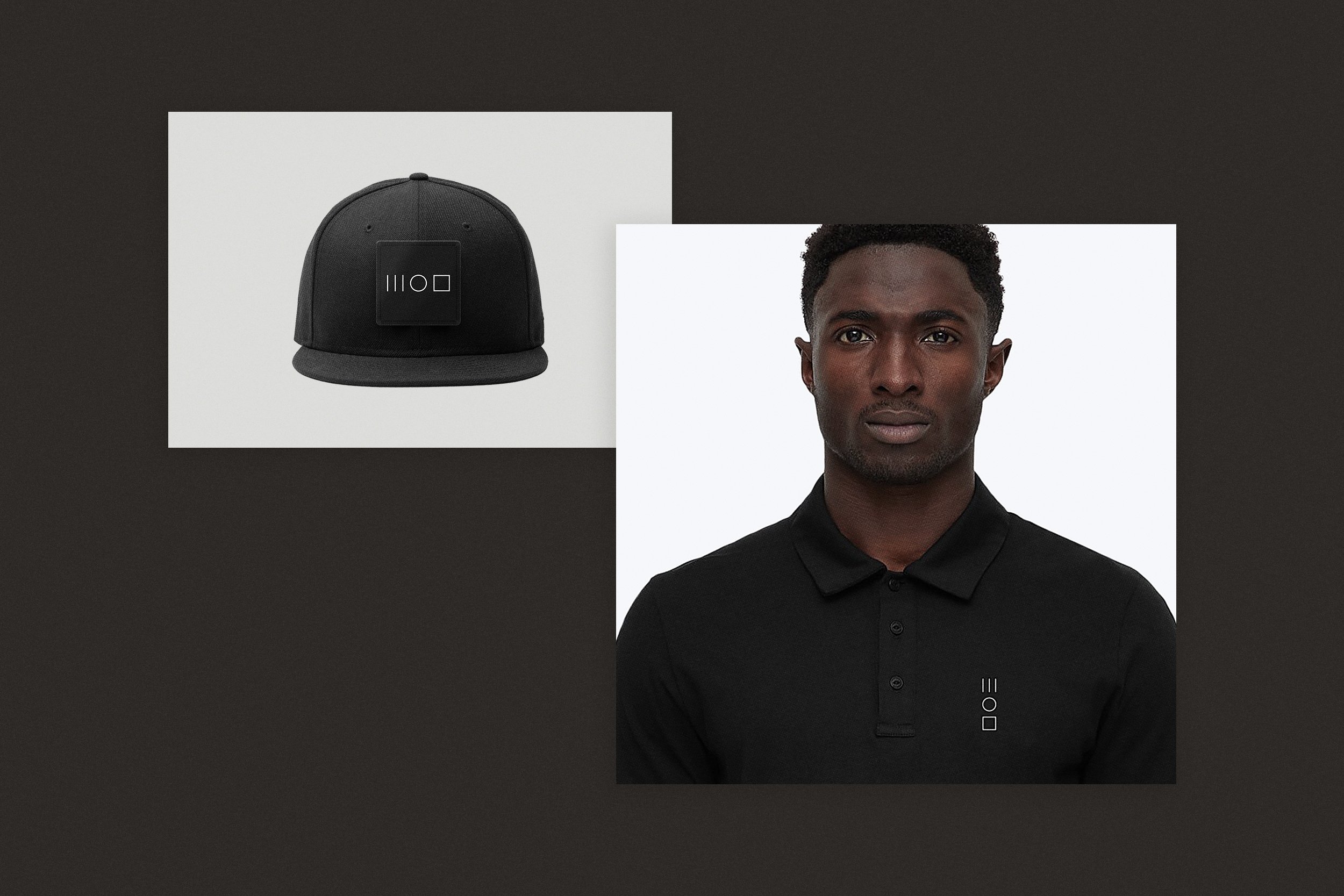
We designed a fairly simple system that’s lead by their sigil—the primary logo for the brand. It’s intended to spark curiosity and invoke their progressive character, incorporating the use of three modernized runes to form an abstract visualization the name, MOD.

“I love beer, design, & beverages that make me feel kinda funny. So, MOD was a natural fit & an awesome opportunity to smash those things together, creating a brand that felt a little bit different than the traditional beverage brands out there.”
— Steve Cousins
MOD Beverage Inc.
Creative Direction & Design
Strategy / Identity / Graphic Design / Packaging / Messaging / Print / Digital / Social
Produced at Super Collider